There is an amazing course for beginners in Data Science on edX by MIT: Analytics Edge. The material is great – the assignments are plentiful and I think its great practice – my only problem is that its in R-and I have decided to focus more on python. I decided it would be an interesting exercise to try and complete all the assignments in python -and boy it it has been so worthwhile! I’ve had to hunt around for R-equivalent code/ syntax and realized that there are some things that are so simple in R but convoluted in python!
I will be posting all my python notebooks on github (see github repo: Analytiq Edge in Python), along with the associated data files as well as the assignment questions. This blog post deals with data analysis of assignments posted in Week 1.
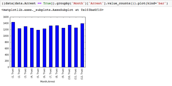
I had not understood the power of ‘value_counts’ and ‘groupby’ command in python. They are really useful and powerful. For example, in the Analytical detective notebook, where we are analyzing Chicago street crime data from 2001-2012, and we need to figure out which month had the most arrests, one can create a ‘month’ column using the lambda function and then plot the value_counts.

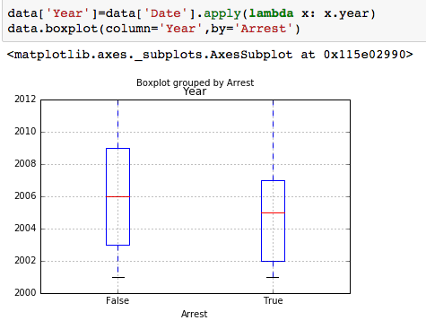
To find what the trends were over the 12 years -its useful to create a boxplot of the variable “Date”, sorted by the variable “Arrest” showing that the number of arrests made in the first half of the time period are significantly more, though total number of crimes is more similar over the first and second half of the time period.
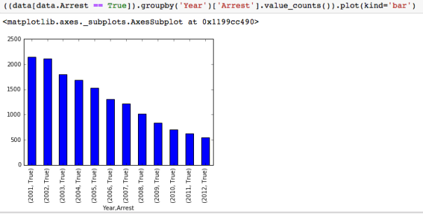
Another way to check if that makes sense, is to plot the number of arrests by year:
groupby- with MultiIndex
With hierarchically indexed data, one can group by one of the levels of the hierarchy. This can be very useful. For example, to answer the question: “On which day of the week do the most motor vehicle thefts at gas stations happen? “, we can first define a new dataframe as: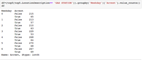
and then groupby level 0 and then sum-note we are not asking when most arrests happen, but most thefts happen-so we need the sum of arrests and no arrests!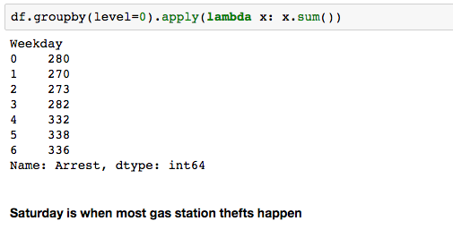
Pretty cool huh?
Assignment using ‘Demographics and Employments in the US’ dataset also uses some neat usage of groupby. For example to find ‘How many states had all interviewees living in a non-metropolitan area (aka they have a missing MetroAreaCode value)?’, one can do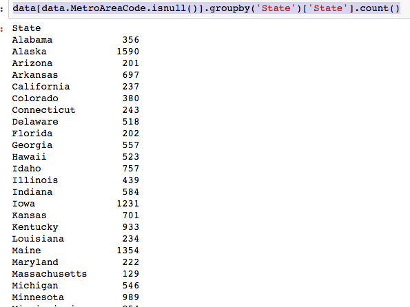
and if one wants just the list of states:

To get how many states had all interviewees living in a metropolitan area, ie urban and all rural:

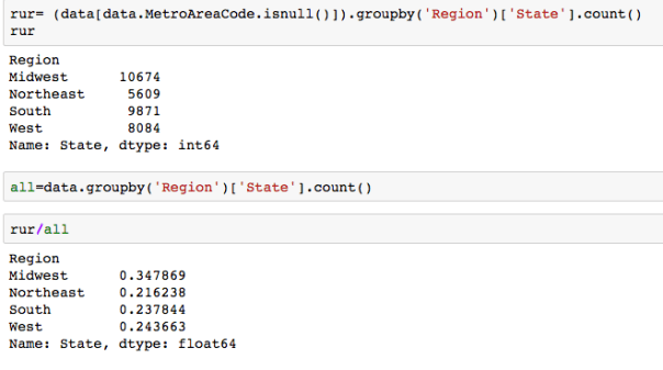
which region of the US had largest proportion of interviewees living in a non metropolitan area? One can even find proportions:
 The dataset with stock prices ( see Stock_dynamics.ipynb) is really useful the play around with different plotting routines. Visualizing the stock prices of the five companies over a 10 year span -and seeing what happened after the Oct 1997 crash:
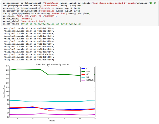
 Using groupby to plot monthly trends:
Pretty cool I think!
Take a look at the datasets- and have fun!
