Category Archives: DataScience

Lessons in Linear regression- Analytics Edge in python: Week 2

As I have said before, this course is in R- and trying to perform all the tasks in python is proving to be an interesting challenge. I want to document the new and interesting  things, I am learning along the way. It turns out that the way most generic way to run linear regression in R, is to use the lm function. As part of the summary results, you get a bunch of extra information like confidence intervals and p values for each of the coefficients,  adjusted R2, F statistic etc that you don’t get as part of the output-in sklearn -the most popular machine learning package in python. Digging a bit deeper, you can see why:

  • scikit-learn is doing machine learning with emphasis on predictive modeling with often large and sparse data.
  • statsmodels is doing “traditional” statistics and econometrics, with much stronger emphasis on parameter estimation and (statistical) testing. Its linear models, generalized linear models and discrete models have been around for several years and are verified against Stata and R – and the output parameters are almost identical to what you would get in R.

For this project; where I am trying to translate R to python; statsmodels is a better choice. Statsmodels can be used by importing statsmodels.api, or the statsmodels.formula.api and I have played around with both. Statsmodels.formula.api uses R like syntax as well, but Statsmodels.api has a very sklearn -like syntax. I have explored using linear regression in a few different kinds of datasets: (github repo)

  • Climate data
  • Sales data for a company
  • Detecting flu epidemics via search engine query
  • Analyzing Test scores
  • State data including things like population, per capita income,murder rates etc

There are a lot of wonderful  blogs/tutorials on Linear Regression. Some of my favorite are:

What is different about Analytics edge is that that is a lot of emphasis on the intuitive understanding of the output of the regression algorithm.

So what is a linear regression model?     

This question has confused me at times because :

  • y=Bo+B1X1+B2X2
  • y=B0+B1(lnX1)
  • y=Bo+B1X1+B2X**2   are all linear models, but they are not all linear in X !!

From  what I understand now, a regression model is linear, when it is linear in the parameters. What that means is there is only one parameter in each term of the model and each parameter is a multiplicative constant on the independent variable. So in the above example, (lnX1) is the parameter or variable, and the function is linear in that parameter. Similarly, (X**2) is the variable and the function is linear in that  variable.

Examples of non-linear models:

  • y=B1.exp(-B2.X2)+K
  • y=B1+(B2-B1)exp(-B3X) +K
  • y= (B1X)/(B2+X) +K

A really important analysis to perform before you run any multivariate  linear regression model is to calculate the correlations between different variables -this is if you include because highly correlated variables as independent variables in your model, you would get some unintuitive an d inaccurate answers!! For example, if I run a multiple regression model to predict average global temperature using atmospheric concentrations of most of the greenhouse gases available from the Climatic Research Unit at the University of East Anglia, this is my output:

screen-shot-2016-09-08-at-4-37-02-pm

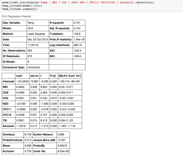
If we examine the output, and look at the coefficients and their corresponding  p_values, ie the P>|t| column, we see that  according to this model, N2O and CH4 which are both considered to be green house gases, are not significant variables!  ie the P>|t| values for those coefficients is higher that the rest.

So what is  P>|t|?                                                                                                                                           P >|t| is  probability that the coefficient for that variable is Zero, given the data used to build the model. The smaller this probability, the less likely the coefficient is actually Zero. We want independent variables with very small values for this. Note that if the coefficient of a variable is almost Zero, that variable is not helping to predict the dependent variable.

Furthermore, the coefficient of N2O is negative, implying that the global temperature is inversely proportional to the atmospheric concentration of N2O. This is contrary to what we know!  So what is going on?

It becomes clear when  we examine the correlations between the different variables:

screen-shot-2016-09-08-at-1-40-13-pmWe can see that there is  a really high correlation between N2O and CH4:                 corr(N2O,CH4)=0.89  

Ok, so what does that mean?  Multicollinearity refers to the situation when two independent variables are highly correlated – and this can cause the coefficients to have non-intuitive signs. What that means is that if, N2O and CH4 are highly correlated, it may be sufficient to include only one of them in the model. We should look at other highly correlated variables.

Our aim is to find a linear relationship between the fewest independent variables that explain most of the variance.

How do you measure the quality of the regression model?

  • Typically when people say linear regression, they are using Ordinary Least Squares (OLS) to fit their model. This is what is also called the L2 norm. The goal is to find the line which minimizes the sum of the squared errors.
  • If you are trying to minimize the sum of the absolute errors, you are using the L1 norm.
  • The errors or residuals are difference between actual value and  predicted value. Root mean squared error (RMSE ) is preferred over Sum of Squared Errors (SSE) because it scales with n. So if you have double the number of data points, and thus maybe double the  SSE, it does not imply that the model is twice as bad!
  • Furthermore, the units of SSE are hard to understand-RMSE is normalized by n and has the same units as the dependent variable.
  • R2: the regression coefficient is often used as a measure of how good the model is. R2 basically compares how the model to a  baseline model ( which does not depend on any variable) and is just the mean of the dependent variable (ie a constant). So R2 captures the value added from using a regression model.                                                         R2= 1 – (SSE/SST)      where SST=total sum of squared errors using the baseline model.
  • For a single variable linear model, R2= Corr( independent Var, dependent Var) **2.
  • When you use multiple variables in your model, you can calculate something called Adjusted R2: the adjusted R2 accounts for the number of independent variables used relative to number of data points in the observation. A model with just one variable, also gives an R2 -but the R2 for a combined linear model is not equal to the sum of R2’s of independent models (of individual independent variables). ie R2 is not additive. 
  • R2 will always increase as you add more independent variables – but adjusted R2 will decrease if you add an independent variable that does not help the model (for example if the newly added  variable introduces collinearity issues!) This is good way to determine if an additional variable should even be included ! However, adjusted R2 which penalizes model complexity to control for overfitting, generally under penalizes complexity. The best approach to feature selection is actually Cross validation.
  • Cross-validation provides a more reliable estimate of out-of-sample error, and thus is a better way to choose which of your models will best generalize to out-of-sample data. There is extensive functionality for cross-validation in scikit-learn, including automated methods for searching different sets of parameters and different models. Importantly, cross-validation can be applied to any model, whereas the methods described above (ie using R2) only apply to linear models.

For skewed distributions it is often useful to predict the logarithm of the dependent variable instead of the dependent variable itself. This prevents  the small number of unusually large or small observations from having an undue effect on the sum of squared errors of predictive models. For example, in the Detecting Flu Epidemics via Search engine query data  python notebook, a histogram of  the percentage of Influenza like Illnesses (ILI) related physician visits is:

screen-shot-2016-09-08-at-5-32-56-pm     
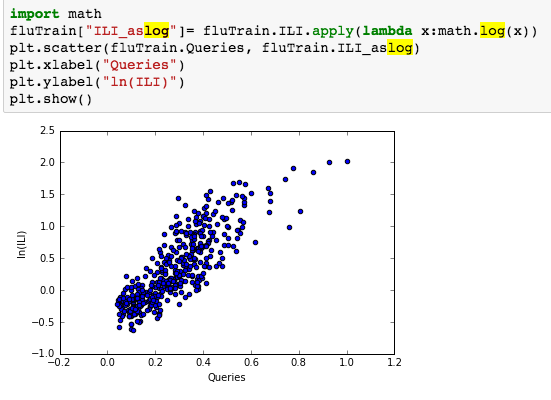
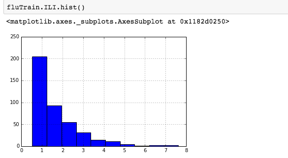
suggesting the distribution is right skewed- ie most of the ILI values are small with a relatively large number of values being large. However a plot of the natural log of ILI vs Queries shows that their probably is a positive linear relation between ln(ILI) and Queries.

:  screen-shot-2016-09-08-at-5-37-16-pm

Time Series Model: 

In Google Flu trends problem set, initially we attempt to model log(ILI) as a function of Queries:

screen-shot-2016-09-11-at-2-05-43-pm

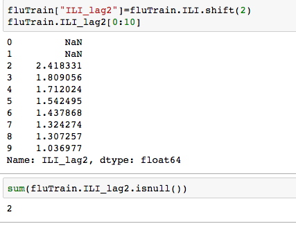
but since the observations in this dataset are consecutive weekly measurements of the dependent and independent variable, it can be thought of as a time-series.  Often Statistical models can be improved by predicting current value of the dependent variable using past values. Since most the ILI data has a 1-2 week lag- we need will use data from 2 weeks ago and earlier. Well how many such data points are there -ie  many values are missing from this variable ?  Calculating lag:

screen-shot-2016-09-11-at-2-09-51-pm

Plotting the log of ILI_lag2 vs log IL1, we notice a strong linear relationship.

screen-shot-2016-09-11-at-2-12-35-pm

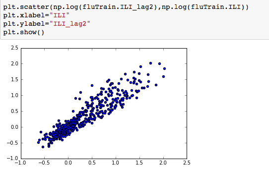
We can thus use both Queries and log(ILI_lag2), to predict log(ILI) and this significantly improves the model- increasing the R2 from 0.70 to 0.90. and the RMSE on the test set also reduces significantly.

Running regression models using all numerical variables is interesting, but one can use Categorical variables as well in the model!

Encoding Categorical Variables : To include categorical features in a Linear regression model, we would need to convert the categories into integers. In python, this functionality is available in DictVectorizer from scikit-learn, or “get_dummies()” function. One Hot encoder is another option. The difference is as follows:

  1. OneHotEncoder takes as input categorical values encoded as integers – you can get them from LabelEncoder.
  2. DictVectorizer expects data as a list of dictionaries, where each dictionary is a data row with column names as keys

One can also use Patsy (another python library) or get_dummies() see- Reading test scores. If you are using  statsmodels, you could also use the  C() function (see Forecasting Elantra sales)

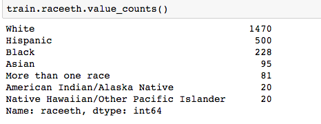
Pandas ‘get_dummies’ is I think the easiest option. For example, in the Reading Test Scores Assignment, we  wish to use the categorical variable ‘Race’ which has the following values:

screen-shot-2016-09-11-at-2-22-03-pm

Using get_dummies:

screen-shot-2016-09-11-at-2-22-59-pm

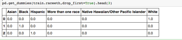
But we need only k-1 = 5 dummy variables for  the Race categorical variable. The reason is if we were to make k dummies for any of your variables, we would have a collinearity. One  can think of the k-1 dummies as being contrasts between the effects of their corresponding levels, and the level whose dummy is left out. Usually the most frequent category is is used as the reference level.

Other great Resources:

edX’s Analytics Edge in Python: exploring the power of pandas ‘groupby’ and value_counts!

There is an amazing course for beginners in Data Science on edX by MIT: Analytics Edge. The material is great – the assignments are plentiful and I think its great practice – my only problem is that its in R-and I have decided to focus more on python. I decided it would be an interesting exercise to try and complete all the assignments in python  -and boy it it has been so worthwhile! I’ve had to hunt around for R-equivalent code/ syntax and realized that there are some things that are so simple in R but convoluted in python!

I will be posting all my python notebooks on github (see github repo: Analytiq Edge in Python), along with the associated data files as well as the assignment questions. This blog post deals with data analysis of assignments posted in Week 1.

I had not understood the power of ‘value_counts’  and ‘groupby’ command in python. They are really useful and powerful. For example, in the Analytical detective notebook, where we are analyzing Chicago street crime data from 2001-2012, and we need to figure out which month had the  most arrests, one can create a ‘month’ column using the lambda function and then plot the value_counts.

Screen Shot 2016-08-19 at 9.41.07 PMScreen Shot 2016-08-19 at 9.43.04 PM

To find what the trends were over the 12 years -its useful to create a boxplot of the variable “Date”, sorted by the variable “Arrest” showing that the number of arrests made in the first half of the time period are significantly more, though total number of crimes is more similar over the first and second half of the time period.

Screen Shot 2016-08-19 at 9.48.15 PM

Another way to check if that makes sense, is to plot the number of arrests by year:

Screen Shot 2016-08-19 at 9.50.30 PM

groupby- with MultiIndex 

With hierarchically indexed data, one can group by one of the levels of the hierarchy. This can be very useful. For example, to answer the question:  “On which day of the week do the most motor vehicle thefts at gas stations happen? “,  we can first define a new dataframe as:Screen Shot 2016-08-24 at 11.39.33 AM

and then groupby level 0 and then sum-note we are not asking when most arrests happen, but most thefts happen-so we need the sum of arrests and no arrests!Screen Shot 2016-08-24 at 11.42.22 AM

Pretty cool huh?

Assignment using ‘Demographics and Employments in the US’ dataset also uses some neat usage of groupby. For example to find ‘How many states had all interviewees living in a non-metropolitan area (aka they have a missing MetroAreaCode value)?’, one can doScreen Shot 2016-08-24 at 11.46.49 AM

and if one wants just the list of states:

Screen Shot 2016-08-24 at 11.48.49 AM.png

To get how many states had all interviewees living in a metropolitan area, ie urban and all rural:

Screen Shot 2016-08-24 at 11.53.00 AM.png

which region of the US had largest proportion of interviewees living in a non metropolitan area? One can even find proportions:

Screen Shot 2016-08-24 at 11.57.09 AM
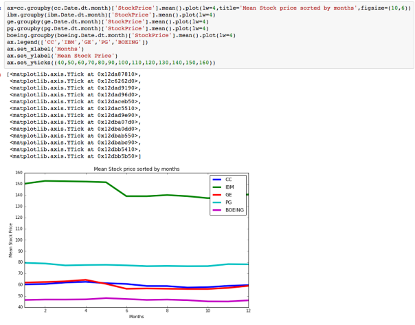
The dataset with stock prices ( see Stock_dynamics.ipynb)  is really useful the play around with different plotting routines.  Visualizing the stock prices of the five companies over  a 10 year span -and seeing what happened after the Oct 1997 crash:

Screen Shot 2016-08-24 at 12.06.25 PM
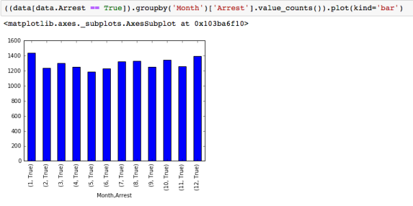
Using groupby to plot monthly trends:

Screen Shot 2016-08-24 at 12.08.59 PM

Pretty cool I think!

Take  a look at the datasets- and have fun!


HDF5, Pytables and Sparse Matrices: Optimizing calculations

Migrating Storage to HDF5/Pytables

Very often, part of trying to provide on demand, instantaneous recommendations involves optimizing calculations between large matrices. In our case, one of the most challenging problems was reading in, and efficiently calculating cosine similarity between tfidf features for every pair of documents in the two corpuses – the papers that could “potentially” be recommended and the users library of papers that they were interested in.   Most recommendation engines try to ease this computational load by doing as much of the prep work before as possible.  Its almost like running a good restaurant – you try to pre-cook (read pre-calculate) all the potential sauces, vegetables (read possible features ) you may need, so you can whip up a great meal (read recommendations) with minimum delay. For us, this is how we handled it:

  • First create a dictionary of possible words from a corpus containing all abstracts from pubmed articles from a couple of years (after removing the  common english  stopwords).
  • Take the corpus of potential recent papers (that could be recommended)  and vectorize it ( i.e. basically represent the collection of text documents as  numerical feature vectors.) There are many ways of computing the term-weights or values of the vector for a document, and after experimenting with a few, we went with one of the most commonly used weighting schemes tf-idf.  We used python’s  scikit-learn library.
  • The actual word-similarity calculation often involved multiplication between matrices of the order of ~650000x 15000 and these reading these in and multiplying them can become both computationally very intensive and impossible to store in memory.
  • Enter HDF5, sparse matrices and pickle to the rescue !
  • Hierarchical Data Format version 5, or “HDF5,” is a great mechanism for storing large quantities of numerical data which can be read in rapidly and allow for sub-setting and partial I/O of datasets. H5py package/PyTables is a Pythonic interface to the HDF5 binary data format which allows you to easily manipulate that data from NumPy.  Thousands of datasets can be stored in a single file,  and you can interact with them in a very pythonic way: e.g you can iterate over datasets in a file, or check out the .shape or .dtype attributes of datasets.  We chose to store our tf-idf matrices in the hdf5 format.
  • Given that we were creating our “vectors” for each paper abstract using all the words in the dictionary; it was very likely that the matrix was very sparse and contained a lot of 0’s. Scipy’s sparse matrices are regular matrices that  only store  non-zero elements, thus greatly reducing the memory requirements. We stored our sparse tf-idf matrices in  using scipy’s sparse matrices in HDF5 format. Further more, Scipy’s sparse  calculations are coded in C/C++ thus  significantly  speeding performance.
  • pickle and cpickle (written in C and about ~1000 times faster)  is a python module that implements a fundamental, but powerful algorithm for serializing and de-serializing a Python object structure i.e it is the process of converting a python object into a byte stream in order to store it in a file/database, maintain program state across sessions, or to transport data over the network. Pickle uses a simple stack-based virtual machine that records the instructions used to reconstruct the object. It is incredibly useful to store python objects and we used it to store the Word dictionary, and easily recreate it everytime we had new papers we needed to convert to word vectors.

Data Science Skills checklist:

What to learn, in what order?

As I try to re-inspire myself to be regular about blogging – and documenting what I learn …

More really good resources:

becoming a Data Scientist — more resources online

The online world is exploding with tutorials, how-to manuals and free resources to help you get into the world of Data Science. In the last 5 months I have seen the addition of so many new MOOCs – looks like every university wants to make sure they don’t get left behind. But this is great news for the consumers- most of these programs are pretty darn good!

Newer offerings on Coursera, Udacity and EdX:                                                                                         In addition to JHU’s Data Science Specialization, here is a partial list of more “data related” specializations (which typically consist of 4-10 courses followed by a project) ie “mini degrees ” you can rack up. Coursera offers “Specializations“, Udacity offers “Nanodegrees” and EdX offers “XSeries“:

Also a  host of new short “paid” programs have sprung up. theses are typically 6-12 week long bootcamps. They typically range between $10,000-$15,000 and can be competitive to get in.

Here is a link to a bootcamp finder in the city of your choice for a price that works for you! And here is another link great link List of data sciencebootcamps

The Data Science Apprenticeship is free, and another way to go. They have  a really nice comprehensive list of Data Science Resources and a cool cheatsheet.

Generating Topic and Personal recommendations

Here is an overview of the features we wanted to use to determine the “score” of a paper that we would then rank and output to the user as recommendations.

recommendation system overview


We also decided that since we had created  these “topics”,  and were running the LDA inferencer on all the new papers everyday classifying  them into topics, we would provide topic based recommendations as well- so if  a new user came in, and was browsing the topics- they could see the top papers in that topic. Ofcourse,  in addition to having high topic probability, these papers were ranked by recency of publication, impact factor of their host journal and tweet counts (if any)!

For personalized recommendations, we decided  we would first use topic similarity between the users papers (or library)  and the corpus of all recent papers to filter or shortlist possible candidate papers to recommend, and then use word similarity to further refine the selection. The final ranking would use our special ‘sauce’ based on tweet counts, date of publication, author quality etc to order these papers and present to the user!

This involved connecting various pieces of the pipeline and by September 2014,  we had a working pipeline that generated and  displayed topic recommendations and library recommendations (if a user had uploaded a personal library) on the website!!

YaY!

Here is a list of books/talks I found useful:                                                                                                           Introduction to Recommender systems  (coursera)                                                                                    Intro to recommender Systems – a four hour lecture by Xavier Amatriain                                         Coursera: Machine Learning class:  Section on Recommender systems

Moving to AWS…

As the project grew, we started downloading tweets from various journal websites and tried to set up an algorithm to parse tweets that were related to particular papers and link them to the paper; thereby producing another “metric” to compare papers by. In addition; we started keeping a detailed records all the authors of the papers and attempted to create a citation database. As complexity grew; we found that our local server was too slow and after some research; decided to take the plunge and move our stuff to AWS-the Amazon Web Server. We created a VPC (a virtual Private cloud), moved our database to Amazon’s RDS (Relational Database Service) and created buckets or  storage on Amazon’s S3 (Simple Storage Service). Its relatively easy to do and the AWS documentation is pretty good. What I found really helpful were the masterclass webinar series.

I launched a Linux based instance and then installed all the software versions I needed like python2.7, pandas, numpy, ipython-pylab, matplotlib, scipy etc . It was interesting to note that on many of the amazon machine, the default python version loaded was 2.6, not 2.7. I scouted  the web a fair bit to help me configure my instance the am sharing soem of the commands below

General commands to install python 2.7  on AWS- should work on most instances running Ubuntu/RedHat Linux:                                   

Start python to check the installation unicode type. If you have to deal with a fair amount of unicode data like I do then make sure you have the “wide build” . I learned this the hard way.                                                     

  • >>import sys  
  • >>print sys.maxunicode

It should NOT be 65564

  • >>wget https://s3.amazonaws.com/aws-cli/awscli-bundle.zip  
  •   >> unzip awscli-bundle.zip          
  • >> sudo ./awscli-bundle/install -i /usr/local/aws -b /usr/local/bin/aws
  • # install build tools
  • >>sudo yum install make automake gcc gcc-c++ kernel-devel git-core -y
  • # install python 2.7 and change default python symlink
  • >>sudo yum install python27-devel -y          
  • >>sudo rm /usr/bin/python  
  • >>sudo ln -s /usr/bin/python2.7 /usr/bin/python
  • # yum still needs 2.6, so write it in and backup script
  •  >>sudo cp /usr/bin/yum /usr/bin/_yum_before_27  
  •  >>sudo sed -i s/python/python2.6/g /usr/bin/yum                                                                                                                                                                       
  • #This  should display now 2.7.5 or later:                                                                                                       >>python  
  •   >>sudo yum install httpd
  • # now install pip for 2.7
  • >>sudo curl -o /tmp/ez_setup.py https://bitbucket.org/pypa/setuptools/raw/bootstrap/ez_setup.py
  • >>sudo /usr/bin/python27 /tmp/ez_setup.py
  • >>sudo /usr/bin/easy_install-2.7 pip  
  • >>sudo pip install virtualenv
  • >>sudo apt-get update    
  •  >>sudo apt-get install git
  • # should display current versions:                                                                                                                   pip -V && virtualenv –version
  • Installing all the python library modules:
  • sudo pip install ipython
  • sudo yum install numpy scipy python-matplotlib ipython python-pandas sympy python-nose
  • sudo yum install xorg-x11-xauth.x86_64 xorg-x11-server-utils.x86_64
  • sudo pip install pyzmq tornado jinja2
  • sudo yum groupinstall “Development Tools”
  • sudo yum install python-devel
  • sudo pip install matplotlib
  • sudo pip install networkx
  • sudo pip install cython
  • sudo pip install boto
  • sudo pip install pandas                    
  • Some modules could Not be loaded using pip, so use the following instead:                       >>sudo apt-get install python-mpi4py python-h5py python-tables python-pandas python-sklearn python-scikits.statsmodels 
  • Note that to install h5py or pytables you must install the following dependencies first:
  • -numpy
  • -numexpr
  • -Cython
  • -dateutil
  • HDF5
  • HDF5 can be installed using wget:
  • >> wget http://www.hdfgroup.org/ftp/HDF5/current/src/hdf5-1.8.9.tar.gz        
  •  >>tar xvfz hdf5-1.8.9.tar.gz; cd hdf5-1.8.9   
  •   >> ./configure –prefix=/usr/local
  • >> make; make install
  • Pytables
  • pip install git+https://github.com/PyTables/PyTables.git@v.3.1.1#egg=tables

**to install h5py make sure hdf5 is in the path.

I really liked the concept of AMI’s : you create a machine that has the configuration that you want and then create an “image” and can give it a name. You have then created a virtual machine that you can launch anytime you want and as many copies of as you want! What is also great is that when you create the image, all the files that may be in your directory at that time are also part of that virtual machine …so its almost like you have a  snapshot of your environment at the time. So create images often (you can delete old images ofcourse!) and you can launch your environment at any time.  Of course you can and should always upload new files to S3 as that it you storage repository.

Another neat trick was to learn that if you can install EC (Elastic Cloud) CLI(Command Line Interface) on your local machine, and set up your IAM you don’t need the you don’t need the .pem file!! Even if you are accessing an AMI in a private cloud; when you set up the instance make sure you click on “get public IP” when you launch your instance and log in as ssh –Y ubuntu@ ec2-xx.yyy.us-west1.compute.amazonaws.com. You can them enjoy xterm and the graphical display from matplotlib, as if you are running everything  on your local terminal. Very cool indeed!

Hierarchical clustering – what does that even mean, in terms of my topic models?

(continued from Topic Modeling …)

So great, I ran LDA, got 150 topics, and now I wanted to see if one could group these topics together using clustering. How can one go about doing that? Well as part of the process, LDA basically creates a “vocabulary” consisting of all the words from the corpus. As this number may get unmanageably large, as part of the LDA preprocessing, one  removes words like a, an, the, if where (also called stopwords) as may not really help decide whether a document belongs to a certain topic or not. There are other text learning tricks like stemming and lemmatization that I thought were not necessarily useful this context, but can often be useful and help control the size of the vocabulary. Well the vocabulary from my run contained ~650,000 words and mallet  allows you to output, for every topic, the word counts for all these words! So now you have a representation of all the topics in terms of their “word vectors”! And one can use this word vector to calculate “distances” between topics.

So after some data wrangling and manipulation, I had the topics represented in a numerical matrix, and ran the clustering algorithm on them. There are many variations of hierarchical clustering algorithms, and I tried most them to see which one seemed the best. I finally went with average linkage and shown below are some of the branches that clustered together. Instead of showing, topic numbers as leaves, we are displaying the word cloud represented by the topic at that leaf:

Figure on the left could be thought to represent a neuroimaging cluster and the figure to the right could be thought to represent disease and trauma. These images are courtesy  Natalie Tellis- Thanks Natalie!!

neuroscience

disease_trauma research

Unfortunately, we had to do a significant amount of manual curation, as some of the clusters didn’t make sense the way we humanly think of these topics …though algorithmically speaking they probably were “sisters”.  We wound up having twenty supertopics or umbrella topics  which contained the topics that LDA had produced. The naming of topics was done manually and was strongly influenced by the top most words for that topic.  

For example the supertopic called “Genetics and Genomics”, and “cellBiology”  have the following subtopics:

tpc_subtpc_slide

Topic Modeling- continued…

So continuing with Topic Modeling…(see earlier post)

Well -the time had come to confront pubmed- the real data I was going to work with. To start with I decided to only use 2013 pubmed data to see if I could run LDA on it and get out meaningful topics. Well, what do I mean by pubmed data: As I explained earlier, pubmed is a repository containing almost *all* research literature pertaining to the biomedical field. Since it is maintained and funded by NIH, we as the tax payers can access or scrape data from it! The only caveat is that only a small subset of papers have the entire text, and they are housed in what is called Pubmed CentralFor the rest of the data we can access things like: title, abstract, keywords (if any), journal name, journal ISSN number, date of publication, date created, date last modified etc.

In preparing the text corpus for LDA, we decided to use only the title and abstract. So, for all the records published in 2013, I parsed out the title and abstract, and created a text corpus containing one record per line, with the pmid as the record identifier. It looked something like this:

The real challenge for LDA is figuring out how many topics or categories should you try to divide the corpus into. I played around with K=10,12,14…500.  It seemed to me that the larger the K, more “fine” grained my topics: but was there an “intrinsic” number of topics that pubmed was naturally divided into… but remember each paper or record has a non zero probability of belonging to every topic- its a mixture of topics. So we could think about each “topic” as a dimension, and each paper belonging to this K dimensional space. And intuitively I felt that we went with a really large K, we would get a really high resolution among topics (which  we could think of as subtopics)- and then if we ran hierarchical clustering on this large number of topics, we could “cluster” similar topics thus naturally forming the “super topics”. I was excited. The challenge was that as K grew large, so did my job of trying to make sure that indeed all the topics made sense.

The road was quite bumpy. For example, I initially included keywords along with the abstracts in the text corpus, but found that keywords were present only in about 30% of the papers!. Earlier I had thought that perhaps the keywords could make up the main “vocabulary” of the corpus and be used to describe it- but that did not seem to be the case. Furthermore, in many cases the keyword tended to be names of particular chemical compounds which could not really “describe” the paper. I also had to check and see if the topics made sense. One way to do this was, for a  given value of K, to look at the top 20 words of the topic and see if the words seem to point to a coherent topic. If so, then pull out all the papers that had a high probability of being assigned to that topic (say >0.7) and look at them.

To see how good my topic modeling really was, I decided to ask the inverse question: if I picked specific journals ( that I know were represented in the corpus) , pulled out all the papers from journals, and summed the topic probabilities of those papers, I would get a “topic distribution” for that set of journals. What did that look like? I decided to pick specialized journals like “Cancer”, “Oncology Letters”, “Oncoimmunology”, OncoTargets (which could represent a specific topic “cancer”) and The Science of the total environment, Environmental pollution, Environmental toxicology and pharmacology, and  Environmental toxicology and chemistry which could be thought to represent “environmental science”.

Figure A below is the topic distribution for the journal “Cancer“. As you can see topic 13 has avery high representation. Figure B shows the topic distribution if papers published in Oncology Letters”, “Oncoimmunology” and “OncoTargets” are included. You can see, topic 13 continues to have a high representation, but representation for topic 3 has also gone up. 

Figure A .  Cancer1  

Figure B.  Cancer2

So what are topic 13 and topic 3? Here are word cloud representations of their top most words:

Screen Shot 2014-10-02 at 10.15.51 PM  topic 13      Screen Shot 2014-10-02 at 10.16.45 PM   topic 3


These word clouds make sense given that the journals were Cancer, Oncology letters etc; the high representation of topic 13 is very heartening.

 Figure C. below is the topic distributions for the journal The Science of the total environment, and Figure D is the topic distribution for papers from journals The Science of the total environment, Environmental pollution, Environmental toxicology and pharmacology, Environmental toxicology and chemistry. Topics 4 and 2 are the most dominant.

  Figure C.  env1

Figure D. env2 

And here is  the word clouds for topics 4:   Screen Shot 2014-10-02 at 10.34.35 PM

As you can see it doesn’t conjure up the topic “environmental science”. But then the question is, is the value of K too small to “resolve” the topic “environmental science”? we can look at what happens when K is larger. Figure E shows the distribution of the same papers as included in Figure D, but assuming that we have run lda with K=50 on them.

env3

As you can see, it topic 15 that dominates. Here is the word cloud for topic 15 and this looks much more like environmental science!!

Screen Shot 2014-10-02 at 10.47.05 PM

So what value of K( ie number of topics) should we go with?                                                                       After conducting many experiments like these, we decided to go with K=150. Yes, K=150 is a large number but the thinking was that we could run the hierarchical clustering  on the topics themselves and see if how they clustered together and then each cluster could be considered a “supertopic”  or category and the topics that were contained in it,  would be the finer classification.  On the other hand 150 was manageable , in case we needed to perform some manual curation.

Data Science- learning from MOOCS’s…

Coursera has changed my life. My husband calls me a MOOC junkie. For the uninitiated, MOOC’s are “Massive Open Online Courses” and for me when I decided I wanted to switch fields, they were a godsend. There a lot of them around now, but in my opinion, the best ones by far are:

For statistics, machine learning, artificial intelligence and computer science; these places can give you a great education for almost free. When I first started; about 18 months ago, they are all new and free. Coursera came out of Stanford, Udacity also from an ex-Stanford professor and edX by Harvard/MIT on the east coast. Interestingly enough, there have been free courses available online for a long time: Stanford Online,  Carnegie Mellon University’s Open Learning Initiative , UC Berkeley’s lectures on YouTube, and MIT’s OpenCourseWare (OCW). But they never really caught on like Coursera and Udacity did.  So some of the classes I have taken on Coursera, which I think have helped me in this new field:

Machine Learning
Data Analysis
R Programming
Natural Language Processing
Mathematical Biostatistics Boot Camp 1
Introduction to Data Science
Algorithms: Design and Analysis, Part 1
Introduction to Recommender Systems
Core Concepts in Data Analysis
Social Network Analysis

About six months ago they offering “Certification Programs” in certain areas and Johns Hopkins University  has a nine-course certification at $49 a course. Rice University offers a great certification called “Fundamentals in Computing” , which is all done using python. Their courses are quite challenging. EdX has some great courses too:

Learning From Data
Introduction to Statistics: Probability
Introduction to Statistics: Descriptive Statistics
Introduction to Statistics: Inference

All the above courses, have a fixed schedule, like a regular class. You have assignments due every week, lectures to listen to, reading to do -so its not “self paced”. Some of the courses have been quite demanding and time consuming – but very rewarding. There are course projects that are then”peer assessed” based on a rubric that you are provided -its not perfect ; but it works rather well I think.

Udacity has a different model. They are “self paced”- they used to be free but a few months ago added a paid option where you can “check in” with a coach; and have your work reviewed.  I thought they were a bit expensive ~$150/month.  I prefer to be given deadlines that set them my self! They have a lot of Data Science courses as well.